On Typing and Caring

If you write things, then write everything with care and attention.

Everything.

If you spend two hours meticulously crafting a blog post or six months editing your manuscript, don’t even think it’s alright to clumsily shit out a three-sentence email full of mechanical errors, typos and poorly-worded sentences just because your Mom is the only person who will ever read it.

What you write and share all reflects on you. Including emails to friends or coworkers, blog comments, even Tweets and the like. Take the time to do it right.

And it does take more time, certainly. But, so does doing anything the right way instead of the easy way. Funny thing is, you already know what the right way is. You just have to hold yourself to that standard 100% of the time.

Two things to keep in mind:

  • You never know when a hero of yours is going to happen upon something you’ve written.
  • If you always write to the best of your ability, then you’ll always be improving and you won’t need to decide to do something the right way. You’ll just do it. And, you’ll want to do it better.

If you want what you write to be taken seriously, then give a shit.

Everybody makes mistakes, but carelessness is as obvious as it is difficult to forgive.

Creativity in the Trenches

I’ll give it to you straight.

As I write this, it’s a Sunday afternoon and I’m sitting in my friend’s apartment (where there’s air conditioning, which my house lacks, and it’s 95F outside) trying to wrap up the third version of Evernote Essentials. I’ve been here since 8:15 this morning. I spent 8 hours here yesterday doing the same thing: writing, compiling, editing.

Yesterday went well. I wrote a lot of good stuff and I felt like the end was in sight.

Today, not so much.

I’ve read plenty of books on creativity and working and pushing yourself and treating the work like the almost-insurmountable beast that it is. And, man, I felt like I could turn over a Jeep with my bare mitts when I read them.

Right now, though, I’m sitting at this table in front of my computer. I’ve been trying to write for the last 5 hours and I’ve produced a grand total of about 400 usable words. Yesterday, I wrote over 3000 usable words and felt like a machine. For some reason, today, the words aren’t coming.

I could blame any number of possible mitigators for this unfortunate state: the heat, the lack of a break or maybe something to do with sleeping/eating/pooping or whatever. But, according to the books, these are the trials that cripple the “regulars”; the people that rely on inspiration and ideal conditions to create their best work. Not wanting to count myself among the ordinary, I instead sit here and wish and hope and will myself into the mode where I can actually write things that people will find valuable and want to read and that I don’t think is utter shit.

But, I can’t. Not now.

I don’t know if that makes me weak or if I don’t have “what it takes” or some other similar symptom of “ordinary”, but it just ain’t happening.

What it’s Like

When I was a younger kid, a pass through a doorway in my house always meant I would try to jump up and reach the door jamb. I would jump as high and as hard as I could and I longed to feel the tips of my fingers brush up against the wood that held our doors up. Sometimes my Dad would lift me up so I could feel the sensation. And, for much of my life, I couldn’t do it unassisted.

Sure, I could have spent my afternoons conditioning my leg muscles and juicing up and all of that, but as an unmodified 8-year-old, I wasn’t capable of it.

It’s not a problem for me these days. I don’t even need to jump unless I’m in a castle or something.

Right now, I feel like I’m reaching for the door jamb and I can’t quite get to it. And the shit part of it is that I’ve touched this very door jamb before. Lots of times, actually. But not today.

Giving Up

I’m giving up for today. Maybe not even for the whole day. It’s the early afternoon, after all, and perhaps there’s a chance that I’ll find my creativity or muse or whatever goofy name du jour it’s got later today. If I do, it will probably be at the bottom of a modest pour of whisky. Anyway.

I don’t see this as defeat. It’s maddening, certainly, but I’m not going to hang it up forever or anything. I know I have at least a passable talent for this and one off-day isn’t going to derail it.

But, in terms of being a professional (as Steven Pressfield calls it), I believe there are definitely times when creative people bump up against some nameless barrier that stops them from making. Call it what you want (Pressfield’s moniker of choice is “Resistance”, which I actually quite like), but there’s some fat, mostly-immovable thing sitting between me and what I want to do today. And, as I sit here, I don’t have the strength to dislodge it.

And I’m okay with that. Sort of.

Actually, no, I’m not.

Truthfully, I’m brimming over with frustration and anger and self-doubt. This shit needs to get done for a variety of reasons and I don’t have oodles of discretionary time to do it. I borrowed heavily from my “time away from the family” account to get this done and now I’m sitting here having produced what somebody from southern Italy would call “Jack Shit” and I’m ready to snap this computer in half because I can’t make myself do what needs to be done.

Standing Up

Tomorrow will be better. Maybe the temperature will drop a few degrees and maybe I won’t feel like such a f*cking dunce and maybe it will be better. The words may come and the work may get done. Or maybe not.

Either way, I decided a long time ago to not stop trying. Acquiescence in the face of difficulty is a hallmark of “regular” and like hell I’m going to go out like that.

Sorry for the self-indulgent pity party. I love you all. See you tomorrow.

Why I Use Instapaper (and not Evernote) For Reading Stuff Later

Reading Time

I’m not shy about my drooling love for Instapaper. If you’ve not heard of it, the one-sentence description: it lets you easily save web pages to read later, online or offline, and gets rid of all of the cruft (ads, navigation, etc.) and just shows you the text. It’s awesome.

“But”, you may have asked yourself, “why don’t you use Evernote for this function? It seems like such a logical choice given your loud affection for and dedication to Evernote! Guh!”

Unsurprisingly, I’m glad you asked.

Thing is, I get this question somewhat regularly via email from nice people who read this stuff I write, so I thought I’d spell it out for y’all. Y’all? Boom.

Essentially, it comes down to five big reasons why I use Instapaper for reading Internet stuff on [our favorite Internet devices]:

  1. Position “” I’m not a super heady guy, but I do occasionally like to read really long articles published by various magazines like The New Yorker, The Economist and Vanity Fair. Sometimes I get partway through one such article and I won’t have the time to finish reading it in one sitting. With Instapaper, I can stop reading an article somewhere in the middle and the app will sync the position of where I stopped reading back to Le Cloud. So, the next time I pick up my iPhone or iPad and open a partly-read article, I’m jumped right back to where I left off. Spiffy.
  2. Singularity of Focus “” Evernote serves myriad functions for me in terms of storing information: bank statements, my kids drawings, meeting notes, etc. Instapaper serves exactly one function and it’s wicked fast in doing so. When I want something to read something, I can fire up Instapaper and immediately have a big list of options. I could do the same with Evernote, but it would take more time since the data isn’t automatically synced and just finding it (even using a saved search) wouldn’t be as fast.
  3. Sharing and Archiving “” I don’t often do it, but I can easily share articles I read in Instapaper with a couple of taps. Evernote offers some sharing capabilities, but not as many as Instapaper. As far as archiving, it’s kinda funny: all of the articles that I “like” (or “tap the little heart while reading”) are automatically saved to my Evernote account. With Instapaper, I just tap the little trash icon (which should probably be something less like “trash”, but that’s a niggle) and I can send it to the archive with one more tap. In Evernote, I’d almost certainly have to remove a tag (like “to read” or “read later”) to achieve the same effect of getting it off of my pending list.
  4. Easy Addition “” If I want to save a page into Instapaper, it takes exactly one click of the “Read Later” bookmarklet in my browser (either on my Mac or iOS). Evernote would require more interaction: fire up the web clipper, select a notebook, add tags, click Save, etc. Instapaper also removes all of the cruft from around the article I want to read (ads, navigation, comments) so all I get is the text. Evernote can do the same via Evernote Clearly, but it’s still several more clicks/taps to get the job done. And let’s not forget the metric buttload of iOS apps that allow me to save stuff to Instapaper quickly and easily (like Tweetbot and many other iOS Twitter clients). These two, low-friction methods of adding stuff to Instapaper make it the easier choice for me.
  5. Offline Reading “” On iOS (and other mobile operating systems), Evernote doesn’t automatically download all of your notes because it’s a good citizen that doesn’t want to chew up all of the storage space on your device. This is a good thing. Instapaper, on the other hand, always downloads all of the content that’s waiting for me. This means that I can fire up Instapaper on my iPhone or iPad before hopping on an airplane and I’ll have bunches of articles to read without needing an Internet connection. And because Instapaper’s data is fairly lightweight””it’s mostly text, after all””the amount of space occupied on my devices by Instapaper data is pretty stinkin’ little.

“But sir!”, you may be saying to yourself, “how could you speak ill of your beloved Evernote!? Let us burn thee as an heretic! Guh! GUUH!”

Don’t misunderstand me, folks.

I love Evernote. Obviously. My point here is not to disparage my beloved Evernote, but rather to highlight an app that, if you ask me, has solved a real problem for me in a most excellent fashion.

Could you do accomplish the same objective with Evernote? Absolutely. And I did use it for such a purpose, once upon a time. I just found Instapaper to be a superior solution to a specific problem I had.

If you read stuff on the Internet and haven’t tried Instapaper (for the Web, as well as both iOS and Android), I’d highly recommend doing so. I’m a fan and you probably will be, too.

Photo by CrazyUncleJoe

A Fellow Internet Citizen Needs Your Help

Many years ago, I was fired from a (seriously crappy) job. As I drove home from what was my office with my proverbial box of desk crap sitting on the seat next to me, I was scared. My wife and I were young and didn’t have much money and I assumed the worst: we’d be living in our car and showering in gas station bathrooms and our whole lives would be in the (figurative) toilet.

When I got home, my wife assured me that this wouldn’t be the case; we were surrounded by people who love us and we’d have help if we ever found ourselves in a position where we couldn’t help ourselves. We’d get back on our feet and everything would be fine. We wouldn’t die.

An Internet acquaintance of mine is currently living my nightmare. Through a series of unfortunate (ok, worse than that) circumstances, he’s literally on the street. He’s getting access to the Internet sporadically, but the guy is effectively homeless.

(You can read the story here)

I know that if that ever happened to me, I’d get help. Probably from many of you.

And now, I’m asking you to help him.

Yes, I realize that you probably don’t know him. Hell, I barely know him, but I can see the desperation in his words and after seeing pictures of him with his boy, I’d feel like a huge a-hole if I didn’t do what I could to help the guy out.

A buddy of his has set up a web page where you can donate money to help this guy get back on his feet. I’ve donated and you should, too. We’re talking about a man who needs a roof over his head and only wants to get back to his son. And, as a father, I can’t imagine what it’d be like to be separated from my kids. Seriously, I’m almost losing my shit just thinking about it.

Go here right now and give whatever you can.

Make your lunch at home for the next few days, skip the afternoon latte, whatever. If you’re reading this, you have a few bucks to spare. Give it and don’t make excuses because excuses are for jerkoffs.

This isn’t a faceless charity full of bureaucrats. You give money and he gets it, plain and simple.

I’ve done it. Your turn. This is important.

Thanks.

And please spread the word.

Instapaper, Ars Technica and Money Dollars

Last year when Ars Technica published the behemoth review of OS X Lion by John Siracusa, I wanted to read it on my iPad without having to visit 20-something different pages on the Ars site. So, I paid $5 for the Ars Premier membership (which, among other things, lets you download the Siracusa reviews as single PDFs). I downloaded the PDF of the review and promptly canceled my subscription. They got my $5 and I got to not be annoyed by the pagination on Ars’ site.

This year, it’s a little different. I use Instapaper for most of my longer-form article consumption and, as of recently, this service is able to figure out if an article has been spread across multiple pages. If it is, each page is captured and the article is rebuilt into a single document, suitable for viewing in the Instapaper app (or on the Web site).

I can’t help but think that Ars (and sites like Ars) must be a little miffed at Instapaper (and services like Instapaper). Naturally, the reason Ars spreads the article out over so many pages is so they can get 20-something ad impressions per reader of the article. Or, as described earlier, you can pay some dough and get a PDF without ads. Instapaper (and services like it) effectively sidestep both monetization efforts by offering the equivalent of the paid option for free.

I’m not singling out Instapaper here as there are many competing services that perform similar functions (though, to be fair, Instapaper created this class of application). I guess I just find it curious and wonder if sites like Ars are doing anything to impede services like Instapaper.

How to Use a TextExpander Snippet to Quickly Generate Amazon Affiliate Links

TextExpander is a wonderful, powerful utility for OS X and iOS. I’m not nearly the snippet maestro the other Brett is, but I use it and love it all the same.

Not long ago, a young Twitter pal named Nic asked me if I knew of TextExpander snippet for generating Amazon affiliate URLs. I didn’t, so I spent a few minutes making one.

First, I’ll cover how to use it. Then, how to works. After that, we’ll get into the caveats. Cool? Ok then.

How to create the snippet

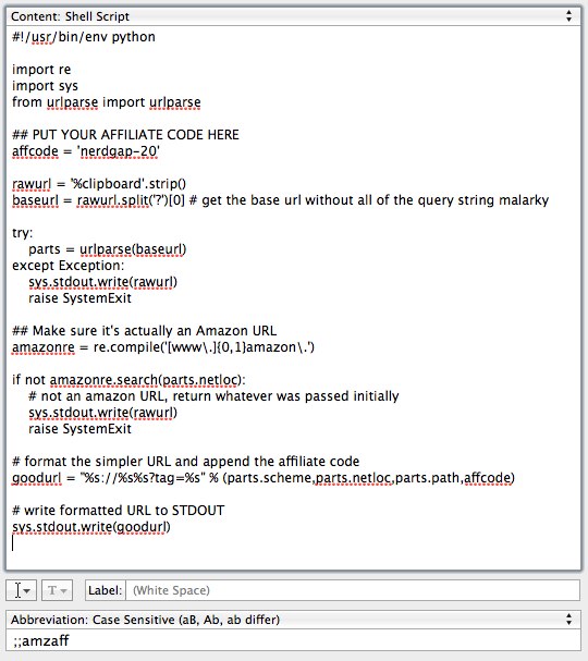
Create a new snippet in TextExpander. At the top of the big text area where the snippet value will go, change the type to “Shell script”. Then copy and paste this code (you can copy easily by clicking “view raw” at the bottom of the box containing the code):

[gist][/gist]

Next, change the value of affcode to whatever your affiliate code is (or, if you’re feeling particularly generous, you could leave mine in there!).

Assign the snippet a shortcut at the bottom of the window. I use “˜;;amzaff’, but whatever you want is fine. When you’re done, the snippet definition in TextExpander should look like this:

Assuming neither you nor I crapped the bed, we should be ready to successfully use this thing.

How to use the snippet

Copy the URL of an Amazon product page to your clipboard. It doesn’t matter if it already has an affiliate code in the URL. Then, issue your shortcut where you’d normally type a URL (browser, email, whatever). If everything goes as planned, the shortcut should be replaced by a nicely formatted Amazon product page URL that contains your affiliate code.

For example, copy this URL to your clipboard:

http://www.amazon.com/DOMAGRON-Novelty”“780984463366-Fake-Stress/dp/B0054QV2A2/ref=sr_1_cc_3?s=aps&ie=UTF8&qid=1342330133&sr=1″“3-catcorr

In your browser’s address bar, delete everything and type your shortcut. It should spit out something like this:

http://www.amazon.com/DOMAGRON-Novelty”“780984463366-Fake-Stress/dp/B0054QV2A2/ref=sr_1_cc_3?tag=nerdgap”“20

How this thing actually works

Note: this section will cover nerdy stuff. Skip to “Caveat Expandor” if you don’t care about nerdy stuff.

This script, at a high level, does the following:

  1. Grabs whatever is currently in the system clipboard and assigns it to the variable rawurl.
  2. All of the query string parameters are removed from the URL (the ampersand and everything after it, in other words). If there are none, it works as expected.
  3. Feeds rawurl to Python’s urlparse library function. If an exception is raised, the original value of rawurl is sent to standard output (STDOUT) and appears wherever the user invoked the snippet.
  4. Assuming the urlparse stuff works, it then checks the domain of the URL to make sure it’s an Amazon URL. If it’s not, then rawurl is returned (just like in the previous step).
  5. If it passes that test, then the URL is rebuilt and the user’s affiliate code is appended.
  6. The new URL is written to standard output where TextExpander regains control and plugs it in wherever the user invoked the snippet.

Caveat Expandor

This is a very basic implementation. If I were a real programmer and had more than twenty minutes to bang on this, I’d write something a good deal more robust that checked for valid Amazon domains or maybe requested the affiliate URL using Amazon’s API. But I’m not, so I didn’t.

And, as with any random hunk of code you find on the web, I make no guarantees as to the servicability of this little hack. This works for me and for Nic (I asked), so that’s good enough for me. If it eats your kitten or something, I’m afraid I can’t do much to help you.

That said, I hope you find this useful. If you do, give me a shout on Twitter and let me know. Oh, and go buy TextExpander because it’s awesome.

Yet Another Incredibly Smart Monetization Strategy that Twitter can Totally Have for Free

Currently, Twitter makes money by shoving “Promoted Tweets” into user’s streams, ostensibly using an algorithm to segment the users into those who might be interested in a particular toot and those who might not (though, this system seems ham-fisted at best). They also have a hashtag sponsorship thingie. I’m not sure what these things cost or if Twitter is creeping toward profitability as a result, but both are a smidge annoying.

I think I have a better way: Paid Accounts.

I’m certainly not the first schmo to come up with such an idea, but see if you think this isn’t stupid.

Some tiny amount of money per month””let’s say $2″”would give you the ability to do the following:

  • Retweet more than twice per day.
  • Mute followers, hashtags or clients for a definite or indefinite period of time (just like Tweetbot does today).
  • See any user’s follower/following counts.
  • View, search and export your entire tweet archive (going back to the beginning).
  • Access to the API and Search-based RSS feeds.

An explanation of the thought process behind each of these:

The Retweet Thing

This feature should be used sparingly and it’s not. Some folks go buckwild crazy with this and, most of the time, it’s annoying. Everybody gets two free retweets per day, but you should have to pay more to get any more than that.

Muting

Muting users is lame because it’s effectively the same as no longer following them, but we all follow a certain number of people because if we didn’t, we’d hear about it and it would become a thing. Muting in Tweetbot gets the job done, though.

Muting annoying clients (like Tweet Old Posts and Paper.li) is one of my favorite things about Tweetbot. Ditto for hashtags. I may love you like a brother, but I’m not interested in hearing every clever quip you hear uttered at the conference you’re attending.

People would use the crap out of this if Twitter offered it. And, I think, many users would pony up a couple bucks a month such a capability.

Follower/Following Counts

These little numbers are the metrics by which users judge one another. If you have lots of followers and follow few people, you’re good at Twitter or something. There are plenty of great Twitter users who fail this test, sadly. Offering access to this information as part of a premium Twitter account would go a long way toward leveling the playing field a bit (and putting some cheddar in Twitter’s pocket).

All of the Tweets

As I type this (and as far as I know), Twitter search only goes back in time about a week or so. If you use the API, you can access the most recent 3200 tweets in your personal archive. By charging folks money, they could (I’m assuming) build out their infrastructure such that paid users could pull down a complete archive of their lunch- and poop-related updates.

API Access

You know how when you say “iPad” on Twitter, many times you’ll immediately receive a reply from somebody who wants you to click their link to maybe just maybe win a free iPad? All that stuff is done by crawling the RSS feeds for a specific search term or by using Twitter’s API. I have a feeling that if using these features cost the user something (anything, really), you’d notice a precipitous dip in the annoying spammy business.

In Conclusion

Most serious Twitter users would be happy to pay a couple of bucks a month for such features, I think. I know I would. A system like this one would give “power users” a bit more “power” and weed out some of the nefarious characters at the same time.

Do you think this is dumb? Not dumb? Use Twitter to let me know.

Launch Center Pro: An Adoption Strategy For Those Having Trouble Adopting It

Launch Center Pro: An Adoption Strategy For Those Having Trouble Adopting It

Launch Center Pro launched amid a good deal of buzz, I think. Lots of tech sites were talking about it shortly before its release and, as an efficiency wonk, I couldn't help but get a little excited.

I bought it the day it was released. I opened it up, played with it for awhile, got the basics down. I even moved it into the Dock area of my iPhone to help encourage adoption.

But, from that day until today, it sat there. I'd open it once in awhile, but only to ponder it and imagine what I could do with it and, more importantly, whether it would speed up the performance of common tasks on my device. Then I'd close it.

Why Launch Center Pro is Difficult to Adopt

Ignoring the dozens of apps I have installed, my daily iPhone usage is comprised mostly of a small number of things:

  • Reading email
  • Listening to audio (music, podcasts and audio books)
  • Reading and posting to Twitter
  • Adding (and occasionally checking off) tasks in OmniFocus
  • Reading from and saving information to Evernote
  • Text messaging and the occasional phone call
  • Reading stuff using Instapaper and the Kindle app
  • Checking my site stats and the day's ebook sales (Clicky is my analytics tool of choice)

Sure, there are other odds and ends, but that's at least 80% of what my iPhone does for me.

Given the regularity with which I perform these actions, it's no surprise that the specific finger movements required to do each one are burned almost indelibly in my muscle memory. In other words, if I decide to check my email, my thumb is already descending on the icon before it's fully drawn on the screen after unlocking the device. Totally not joking.

This is why an app like Launch Center Pro is difficult to adopt. I have to fundamentally change how I use my iPhone. But, between the stories I've heard from people who are loving the app and my own desire to speed things up, I've decided to give it a solid try.

The Launch Center Pro Acid Test

What follows is, as best I can figure, the ideal way to really put Launch Center Pro front and center in the hopes of shoehorning it into my iPhone workflow. I'm not sure how this will shake out, but I think it's worth a try.

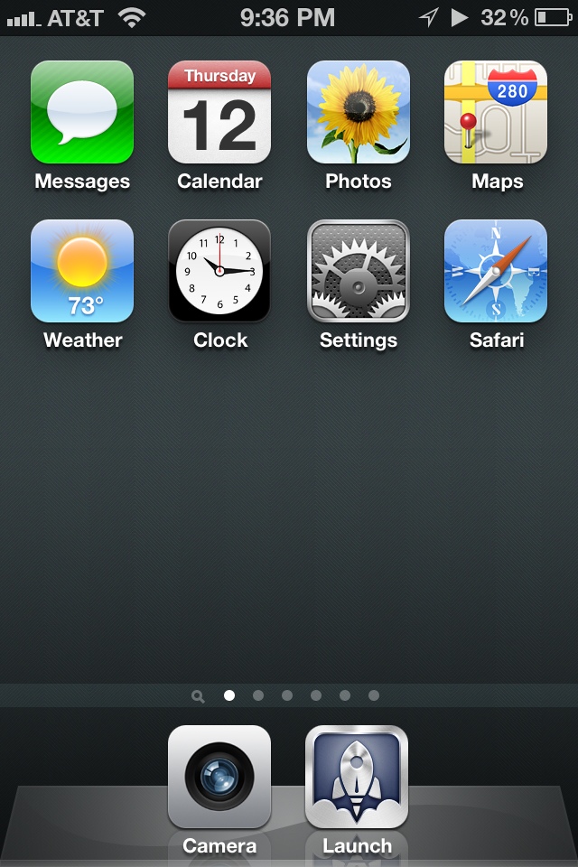
Here's my current home screen, modified to all but demand that I use Launch Center Pro (it's in the dock next to the Camera app):


Pretty barren.

After carefully looking at each app I use that Launch Center Pro supports (it's not all of them, if you're wondering), I took each of those apps and moved them to secondary screens. The only exception is the Calendar app, which I really only launch when an appointment alarm sounds. Everything else is an app I use somewhat regularly that Launch Center Pro doesn't currently work with. And the Camera app stays in the Dock because I don't want to go hunting for it when my kids are doing something cute or I see a three-legged coyote or whatever.

Launch Center Pro's raison d'être is quickly performing actions, not just launching apps. Some example actions would be calling or emailing a specific person, jumping to a specific part of an app, etc. My next step then was to add shortcuts for all of the now-absent home screen apps as well as any common actions. Below is the result (or, at least, the first iteration of the result).


A Tour of My Launch Center Pro Configuration

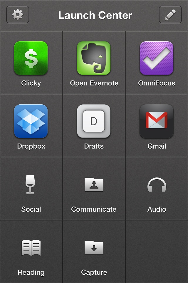
When I fire up Launch Center Pro, this is what appears:

From this screen, I can perform most of my “regular” iPhone actions. The bottom right corner is left empty (for now) because that's typically where my right thumb is hovering, so I won't have to worry about it obscuring anything (more on this in a second). Oh, and Dropbox is there because I frequently launch it to kick off the automatic photo upload thingie it does.

The bottom half of the screen contains “action groups”. If I press and hold “Audio”, for example, the screen turns to this:


I consume lots of audio on my iPhone, so having quick access to these apps is important to me.

“Communicate” reveals these choices:

I communicate with my wife electronically very regularly, so she gets her own “call” and “text” actions. Along with actions for texting a couple of other folks, the last two actions are shortcuts to the New Message view in the Messages app and a list of contacts from which I can choose somebody to call.

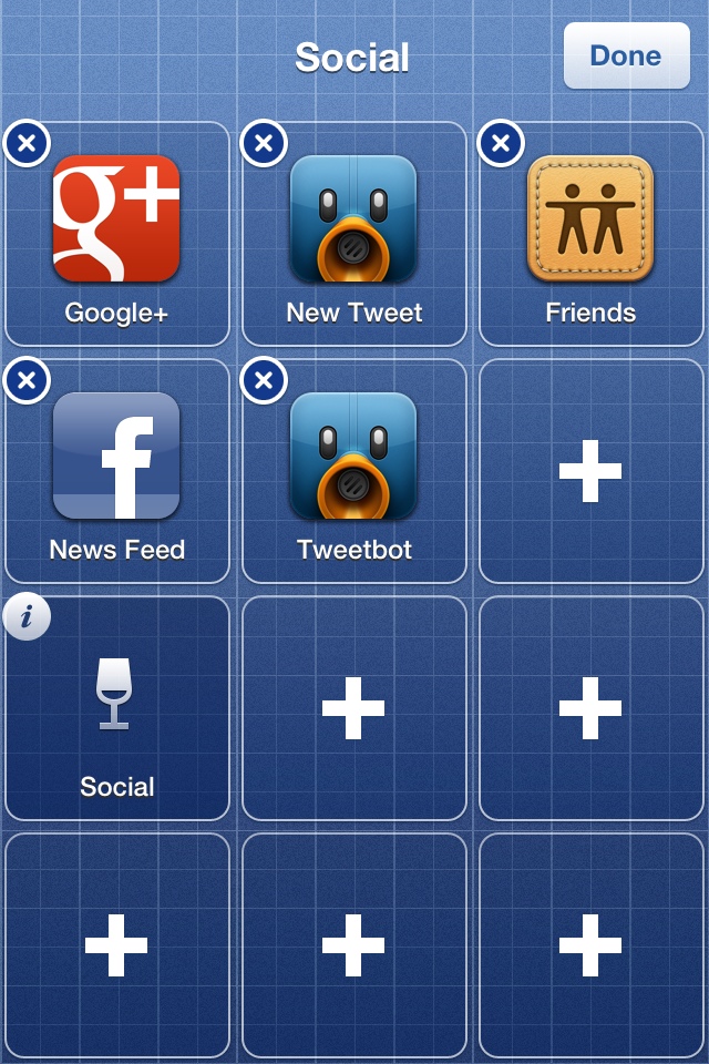
Now, then. “Social”:

Aside from the “New Tweet” option, which opens Tweetbot and plants me in the tweet composition view, the rest of these simply launch the apps. (And, yes, I'm now using Facebook again, but in a very specific and limited capacity).

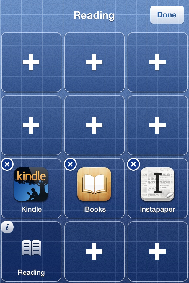
“Reading”:


Unsurprisingly, these are the apps I use to read things. iBooks is really only there because it fit and was easy; I almost never read things in iBooks on my iPhone.

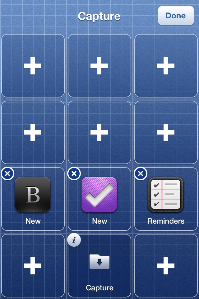
Lastly, “Capture”:

Capturing new ideas, etc. is the name of the game on this screen. OmniFocus for tasks and projects, Drafts for textual stuff (like blog post ideas or Twitter jokes that are still incubating).

Yeah, all of that is pretty straightforward. All of my regular iPhone use cases are spoken for. Now let's talk about the specific reasons why I did it this way.

Guiding Principles

The “Obscured by Thumb” Issue

As we dig into this, it's important to point out that the action groups (“Social”, etc.) defined in Launch Center Pro are only accessible if you press and hold their icons. In other words, if I want to launch Tweetbot, I need to press my thumb on “Social”, drag it onto Tweetbot and release. If I lift my thumb off of the screen while it's still on “Social”, then I'm back at the main screen.

If you look at the groups I've defined above, you'll probably notice that, when activated using my right thumb, the area that's obscured by my thumb/hand is empty. This is quite intentional. I've placed all of the actions within a group such that they'll all be visible when I'm holding down that group's icon.

The Dollop of Friction

My configuration is, albeit somewhat crudely, optimized for doing stuff instead of farting around. Managing email, adding tasks to OmniFocus, jotting something down in Drafts and opening Evernote: these are all at the top level. Twitter, Instapaper and the rest are buried because I want to be faced with the prospect of doing something and actively decide not to in favor of something else.

I'm hoping this little bit of friction will train my brain to be less lazy. I'll admit it's a theory whose effectiveness will be proven or disproven over time, but at least I started off on the right foot or something.

Stinking Badges

This is probably my favorite benefit of all. When an app is displayed in Launch Center Pro, I'm incapable of seeing any unread badges. Normally, I'm a fan of these badges because I'm a bit of a glutton for inputs (which isn't good, frankly), but I'm hoping this new way of doing things will break me of that little fetish. Again, time will tell. But when I launch Launch Center Pro, my eyes aren't immediately drawn to a little red bubble telling me to tap there.

Parting Thoughts

If you're reading this and you're already a Launch Center Pro badass, then my setup will probably look fairly primitive. I haven't ventured into the world of custom URLs, default field values, scheduled actions or any of the other voodoo this app can do. Said badasses will probably argue that these advanced features are where Launch Center Pro really shines. Stipulated.

This is me crawling before I attempt to walk. I know me and I know that if I spend oodles of time making super specialized actions, then I'd call that fiddling. If this setup sticks and I stay with it, then we can talk about how the app can make my breakfast and such. But not before.


How I Got a Kindle eBook Autographed by the Author

How I Got a Kindle eBook Autographed by the Author

20120708-131709.jpg

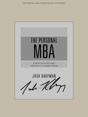
As I mentioned recently, The Personal MBA by Josh Kaufman is one of the best books I’ve read so far this year. And, as it happens, Josh was in Portland for the World Domination Summit. I met him at the opening party and he’s a hell of a cool customer.

Aside from befriending the handsome Josh, our introduction also gave me an opportunity to employ a cool trick I cribbed from Evernote CEO and fellow college dropout, Phil Libin: I asked Josh to “autograph” my electronic (Kindle) version of his book. He kindly obliged.

How the hell did I manage such magic? Glad you asked.

To perform this little trick, you’ll need:

  • An iPad with the Kindle app installed (or iBooks, if that’s your huckleberry).
  • The author’s book downloaded to the app.
  • Skitch installed on your iPad (it’s free).
  • The author to be physically present, ideally of his or her own free will.

And, the steps to complete the trick:

  • Open the book in question using your preferred reading application.
  • Turn back to the title page or cover image at the beginning of the book.
  • Take a screen shot of your iPad screen (press the Home and Sleep/Wake buttons at the same time to do this). This image will now live in the Photos app.
  • Open Skitch for iPad and load up the screenshot you just took.
  • Select the Pen tool in Skitch, make sure the line size is right and the line color will contrast well with the color of the image.
  • Hand your iPad to the author of the book and ask him/her to autograph the image using their finger (or a stylus, if you have one).
  • Publish image to Twitter or Facebook if you want, but make sure you save it somewhere.
  • Bonus Step: Save the signed image to Evernote.

The result, if you’re lucky enough to encounter Josh Kaufman and have the proper equipment, will look a great deal like this:

20120708-131922.jpg

Or perhaps you’re lucky enough to encounter the unstoppably handsome Chris Guillebeau (author of The $100 Startup) while holding the same equipment:

Maybe not quite as cool as being able to yank a signed volume off of your spiffy bookshelf, but I’ll take it.

Why is this particularly cool? The world of writing and publishing is welcoming a whole host of people who are doing it themselves. If you spend a portion of your time interacting with like-minded folks at conferences (like WDS), it would seem you’ll have a good chance of running into authors you like (“published” or not).

And it doesn’t have to stop with books, actually. Meet a blogger who you love that hasn’t yet written a book? Repeat the above steps with a snapshot of the front page of their blog. Pretty badass, right?

Photo by Fairfax Library Foundation

Why Master Yoda is Full of Crap

Yoda
For decades, oodles of people have cited a certain quip given by Master Yoda in The Empire Strikes Back, which reads:

Do or do not. There is no “˜try’.

This is an incredibly idiotic statement.

Inspirational musings like this one are what make people feel bad for failing because, if you ask Ol’ Yoda, they just didn’t decide to succeed.

The Proper Use of Inspiration

Inspiration is great. I’m a big believer in it, frankly, because I know what it is (and, more importantly, what it’s not).

I have a photo of my little boy nestled comfortably below my computer screen at my desk. While I enjoy my work most days, sometimes I need to be reminded of why I’m doing this (or, more correctly, for whom am I doing this). I look at his handsome face and I remember that, if I want to give him all the opportunity and comfort I can, I have to bust my ass to make that happen. Nothing less will do.

What I don’t do is sit at my desk and just hope real hard that my love for my family is going to somehow magically do my work for me. I have to try to produce the best work I’m capable of producing. Sometimes I get there, and sometimes I fall short.

Inspiration can get your ass back to the half-cord of pine in the backyard, but it won’t type chop the logs for you. You need something bigger; a larger goal and a sense of purpose in what you’re doing.

Inspiration is the match stick, not the firewood.

Tweet this

How To Be Inspired (Then, Get Back to Work)

People who buy my thing on how to use Evernote will sometimes send me nice emails about how much they liked it, etc. Those messages are really great and I try to save them (in Evernote, naturally) when they arrive. Occasionally, I’ll peek at them when I’m feeling like a blithering idiot who couldn’t write his way out of a wet paper sack. And it does help.

The trick is harnessing that tiny little burst of joy into actually making something; trying to build my little business into something that will accomplish what I want it to: give my family security and comfort and be an example of what hard work can produce.

Now, it’s Your Turn

Don’t rely on inspiration for anything other than inspiring you to do. Make it the match that starts the fire and know that it will burn out quickly.

The cliché of the Motivational Poster featuring a rowing team or an astronaut is all fine and good if you notice it as you walk back to your desk to make something awesome. Let’s all do that.

And forget that bullcrap Master Yoda is pouring because it’s poison.

Photo by Rhubarble