Launch Center Pro launched amid a good deal of buzz, I think. Lots of tech sites were talking about it shortly before its release and, as an efficiency wonk, I couldn't help but get a little excited.
I bought it the day it was released. I opened it up, played with it for awhile, got the basics down. I even moved it into the Dock area of my iPhone to help encourage adoption.
But, from that day until today, it sat there. I'd open it once in awhile, but only to ponder it and imagine what I could do with it and, more importantly, whether it would speed up the performance of common tasks on my device. Then I'd close it.
Why Launch Center Pro is Difficult to Adopt
Ignoring the dozens of apps I have installed, my daily iPhone usage is comprised mostly of a small number of things:
- Reading email
- Listening to audio (music, podcasts and audio books)
- Reading and posting to Twitter
- Adding (and occasionally checking off) tasks in OmniFocus
- Reading from and saving information to Evernote
- Text messaging and the occasional phone call
- Reading stuff using Instapaper and the Kindle app
- Checking my site stats and the day's ebook sales (Clicky is my analytics tool of choice)
Sure, there are other odds and ends, but that's at least 80% of what my iPhone does for me.
Given the regularity with which I perform these actions, it's no surprise that the specific finger movements required to do each one are burned almost indelibly in my muscle memory. In other words, if I decide to check my email, my thumb is already descending on the icon before it's fully drawn on the screen after unlocking the device. Totally not joking.
This is why an app like Launch Center Pro is difficult to adopt. I have to fundamentally change how I use my iPhone. But, between the stories I've heard from people who are loving the app and my own desire to speed things up, I've decided to give it a solid try.
The Launch Center Pro Acid Test
What follows is, as best I can figure, the ideal way to really put Launch Center Pro front and center in the hopes of shoehorning it into my iPhone workflow. I'm not sure how this will shake out, but I think it's worth a try.
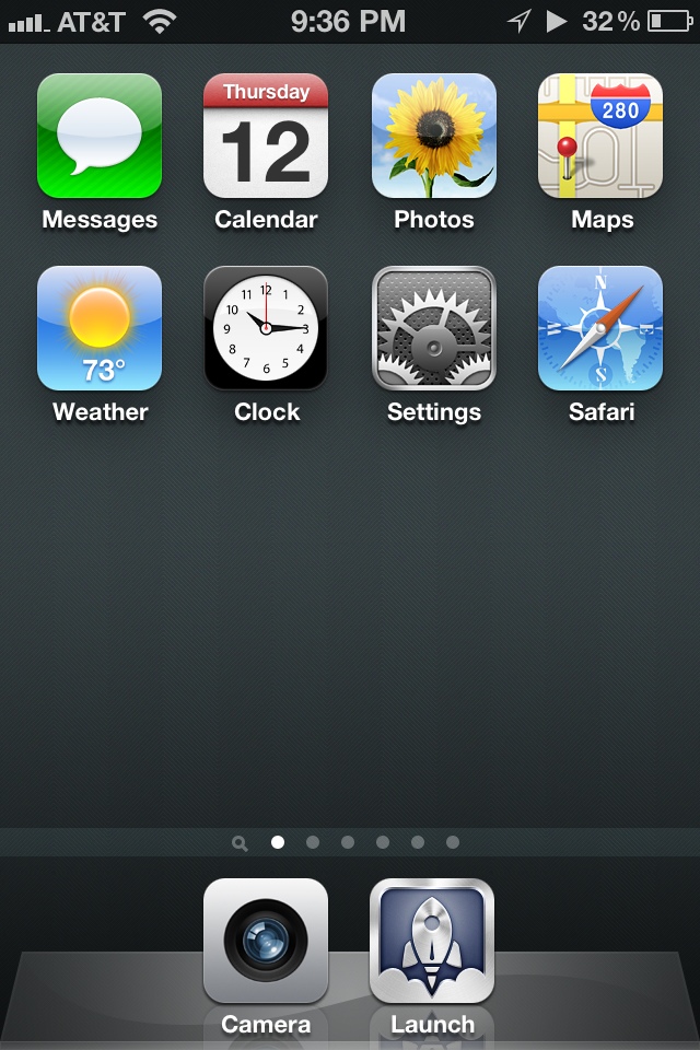
Here's my current home screen, modified to all but demand that I use Launch Center Pro (it's in the dock next to the Camera app):
Pretty barren.
After carefully looking at each app I use that Launch Center Pro supports (it's not all of them, if you're wondering), I took each of those apps and moved them to secondary screens. The only exception is the Calendar app, which I really only launch when an appointment alarm sounds. Everything else is an app I use somewhat regularly that Launch Center Pro doesn't currently work with. And the Camera app stays in the Dock because I don't want to go hunting for it when my kids are doing something cute or I see a three-legged coyote or whatever.
Launch Center Pro's raison d'être is quickly performing actions, not just launching apps. Some example actions would be calling or emailing a specific person, jumping to a specific part of an app, etc. My next step then was to add shortcuts for all of the now-absent home screen apps as well as any common actions. Below is the result (or, at least, the first iteration of the result).
A Tour of My Launch Center Pro Configuration
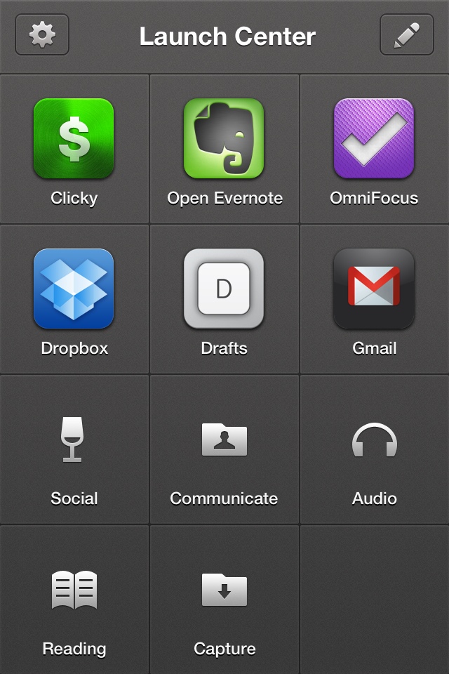
When I fire up Launch Center Pro, this is what appears:
From this screen, I can perform most of my “regular” iPhone actions. The bottom right corner is left empty (for now) because that's typically where my right thumb is hovering, so I won't have to worry about it obscuring anything (more on this in a second). Oh, and Dropbox is there because I frequently launch it to kick off the automatic photo upload thingie it does.
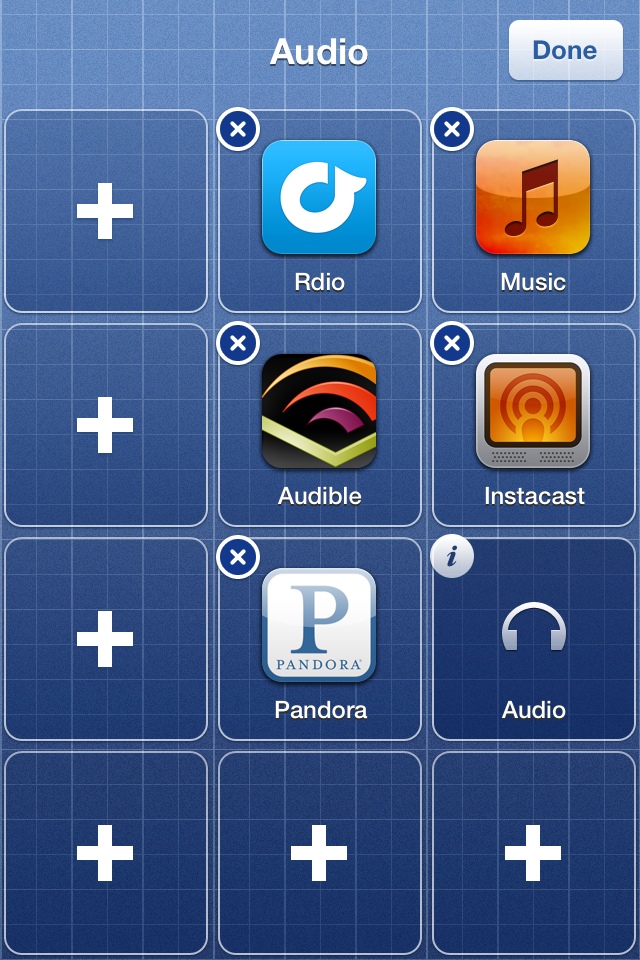
The bottom half of the screen contains “action groups”. If I press and hold “Audio”, for example, the screen turns to this:
I consume lots of audio on my iPhone, so having quick access to these apps is important to me.
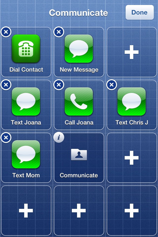
“Communicate” reveals these choices:
I communicate with my wife electronically very regularly, so she gets her own “call” and “text” actions. Along with actions for texting a couple of other folks, the last two actions are shortcuts to the New Message view in the Messages app and a list of contacts from which I can choose somebody to call.
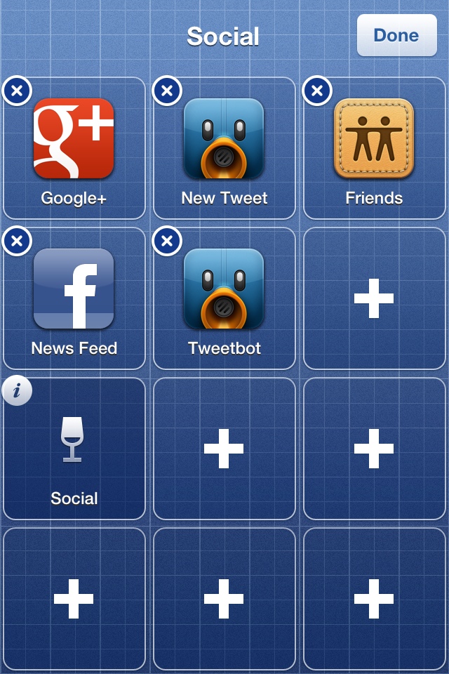
Now, then. “Social”:
Aside from the “New Tweet” option, which opens Tweetbot and plants me in the tweet composition view, the rest of these simply launch the apps. (And, yes, I'm now using Facebook again, but in a very specific and limited capacity).
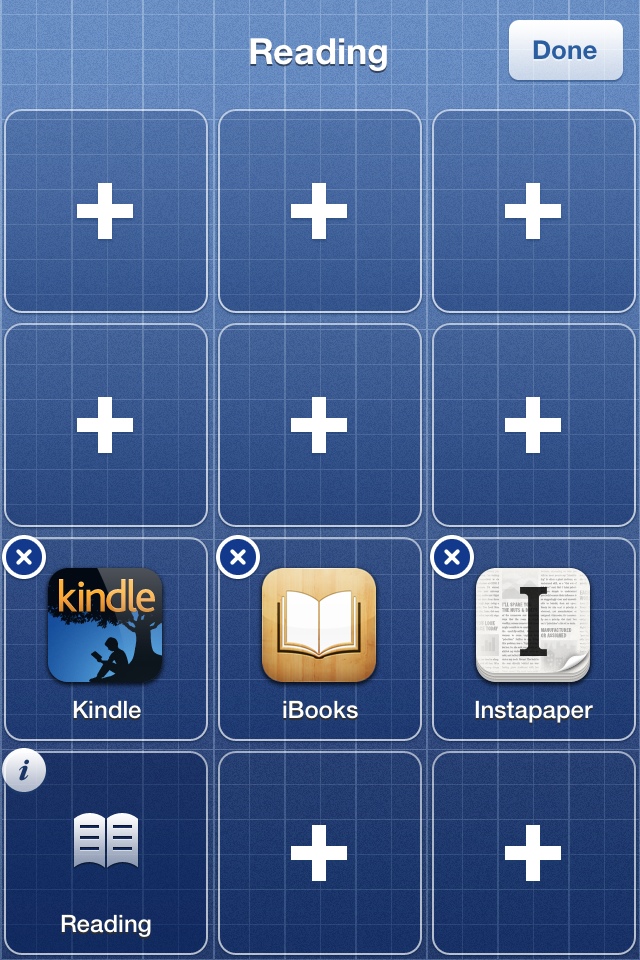
“Reading”:
Unsurprisingly, these are the apps I use to read things. iBooks is really only there because it fit and was easy; I almost never read things in iBooks on my iPhone.
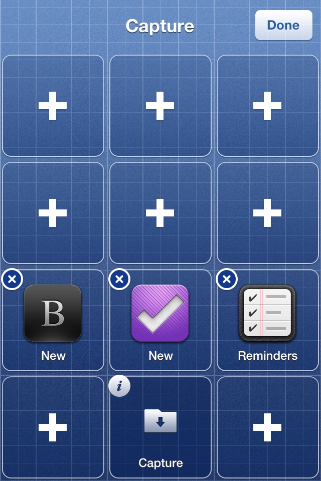
Lastly, “Capture”:
Capturing new ideas, etc. is the name of the game on this screen. OmniFocus for tasks and projects, Drafts for textual stuff (like blog post ideas or Twitter jokes that are still incubating).
Yeah, all of that is pretty straightforward. All of my regular iPhone use cases are spoken for. Now let's talk about the specific reasons why I did it this way.
Guiding Principles
The “Obscured by Thumb” Issue
As we dig into this, it's important to point out that the action groups (“Social”, etc.) defined in Launch Center Pro are only accessible if you press and hold their icons. In other words, if I want to launch Tweetbot, I need to press my thumb on “Social”, drag it onto Tweetbot and release. If I lift my thumb off of the screen while it's still on “Social”, then I'm back at the main screen.
If you look at the groups I've defined above, you'll probably notice that, when activated using my right thumb, the area that's obscured by my thumb/hand is empty. This is quite intentional. I've placed all of the actions within a group such that they'll all be visible when I'm holding down that group's icon.
The Dollop of Friction
My configuration is, albeit somewhat crudely, optimized for doing stuff instead of farting around. Managing email, adding tasks to OmniFocus, jotting something down in Drafts and opening Evernote: these are all at the top level. Twitter, Instapaper and the rest are buried because I want to be faced with the prospect of doing something and actively decide not to in favor of something else.
I'm hoping this little bit of friction will train my brain to be less lazy. I'll admit it's a theory whose effectiveness will be proven or disproven over time, but at least I started off on the right foot or something.
Stinking Badges
This is probably my favorite benefit of all. When an app is displayed in Launch Center Pro, I'm incapable of seeing any unread badges. Normally, I'm a fan of these badges because I'm a bit of a glutton for inputs (which isn't good, frankly), but I'm hoping this new way of doing things will break me of that little fetish. Again, time will tell. But when I launch Launch Center Pro, my eyes aren't immediately drawn to a little red bubble telling me to tap there.
Parting Thoughts
If you're reading this and you're already a Launch Center Pro badass, then my setup will probably look fairly primitive. I haven't ventured into the world of custom URLs, default field values, scheduled actions or any of the other voodoo this app can do. Said badasses will probably argue that these advanced features are where Launch Center Pro really shines. Stipulated.
This is me crawling before I attempt to walk. I know me and I know that if I spend oodles of time making super specialized actions, then I'd call that fiddling. If this setup sticks and I stay with it, then we can talk about how the app can make my breakfast and such. But not before.
